


This fourth blog post in a series of five is the sequel to “Extracting Metadata From the Body of Documents”.
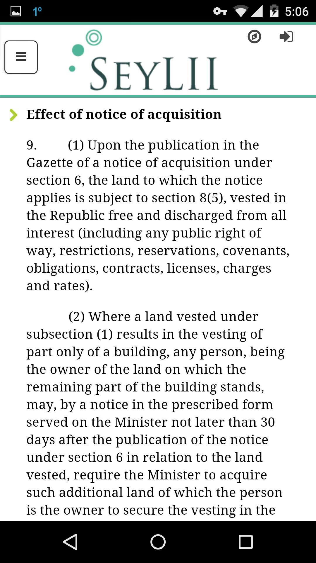
Another unexpected advantage of structured data is the flexibility it provides in relation with online display. The popularity of the mobile web has contributed to multiplying the number of devices of various screen sizes accessing the Internet, including legal information websites. In order to adapt the layout of information to the viewing environment of each individual device, website designers have developed the technique of responsive web design. For example, users accessing a website with the browser of their cell phone appreciate being presented with a clickable table of contents instead of a full length document, which can be arduous to navigate.
Styles inserted in original Word files can serve this purpose well by making it possible to map the structure of complex legal documents, such as legislation and large doctrinal works. Heading styles can be identified and extracted, and corresponding anchors placed at their locations. Moreover, these structural tags can be used to break the full text into chunks of reasonable sizes, guaranteeing quick download speed even on slow Internet connections. When needed, native mobile file formats can also be generated from the same data source.
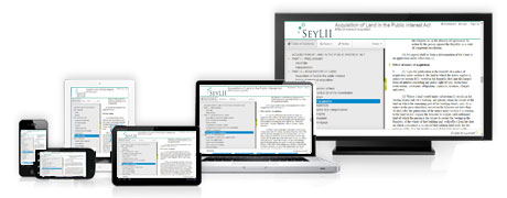
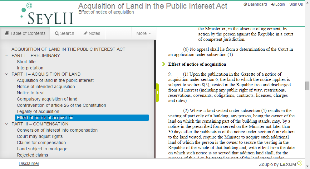
The Seychelles eGray Book, disseminated online with Qweri from Lexum is a perfect example of the potential of responsive design techniques for facilitating mobile access to legal information. Judges of the Seychelles now routinely use the ePub version of the legislation installed on tablets provided to them by the judiciary. Counsels, parties and others not needing the complete legislative set loaded permanently on their own device can access the online version at any time on the SeyLII website. In this case, the full body of each act is inserted in a panel located on the right portion of the screen only if enough space remains available after the table of contents has been displayed in the left panel. If not enough space is available, users are offered the possibility of toggling between the table of contents and the document body by swiping their screen in one direction or the other.
Seychelles eGray Book on mobile phones
Seychelles eGray Book on desktop computers
Read the next blog post “Supporting Accessibility with WCAG 2.0 Level AA Compatibility“.